















Every shade, measured on the film you will print on
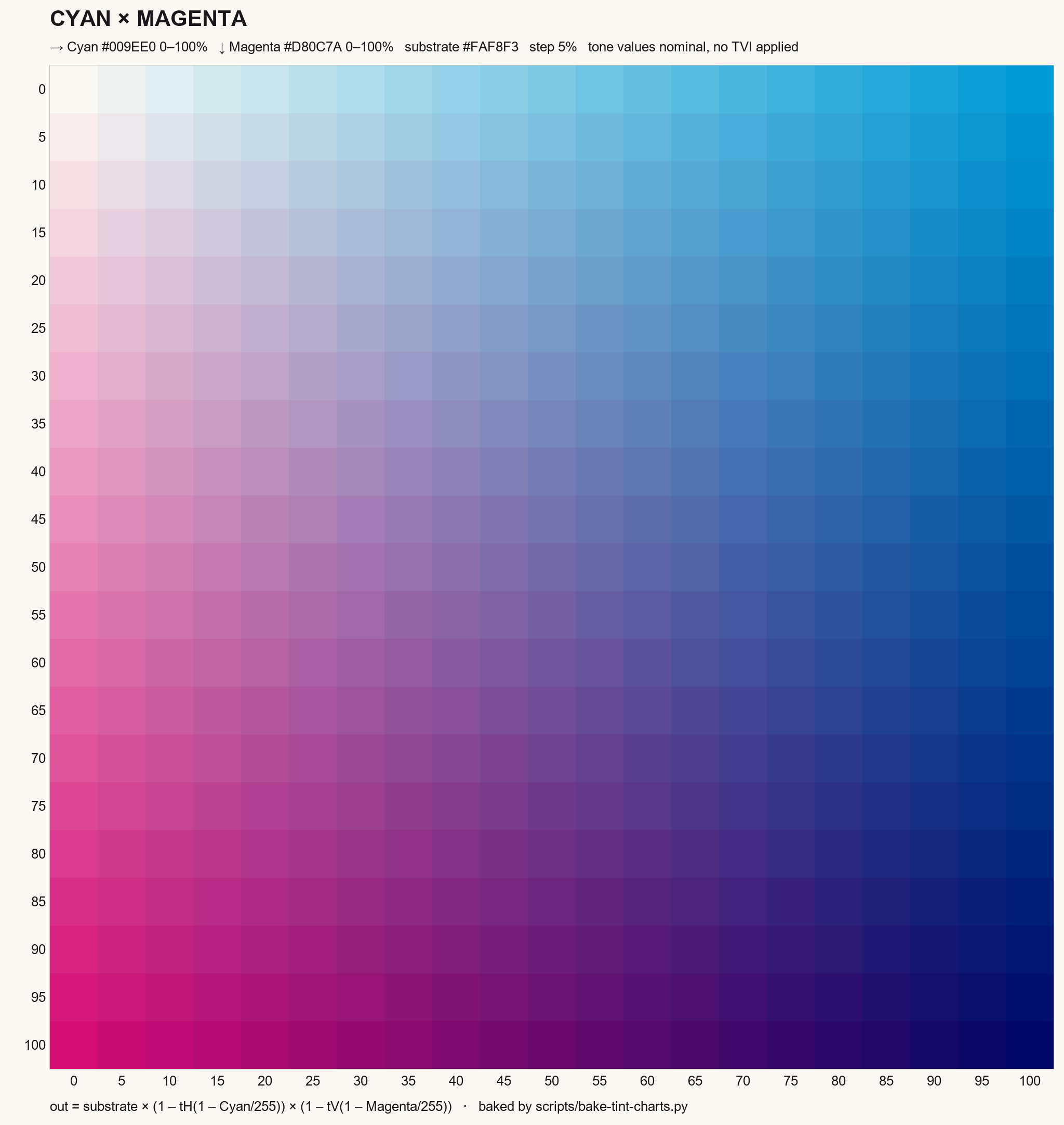
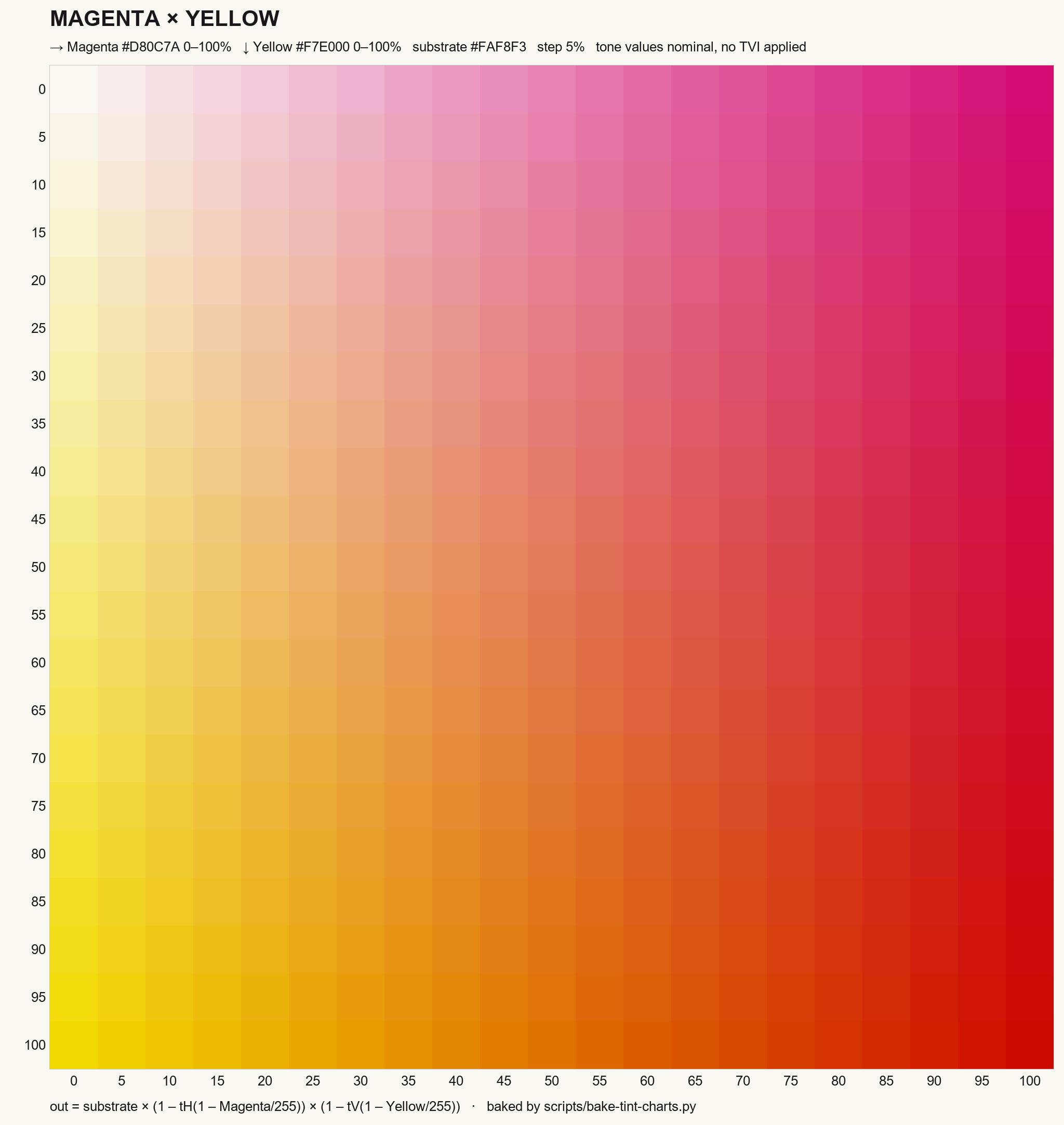
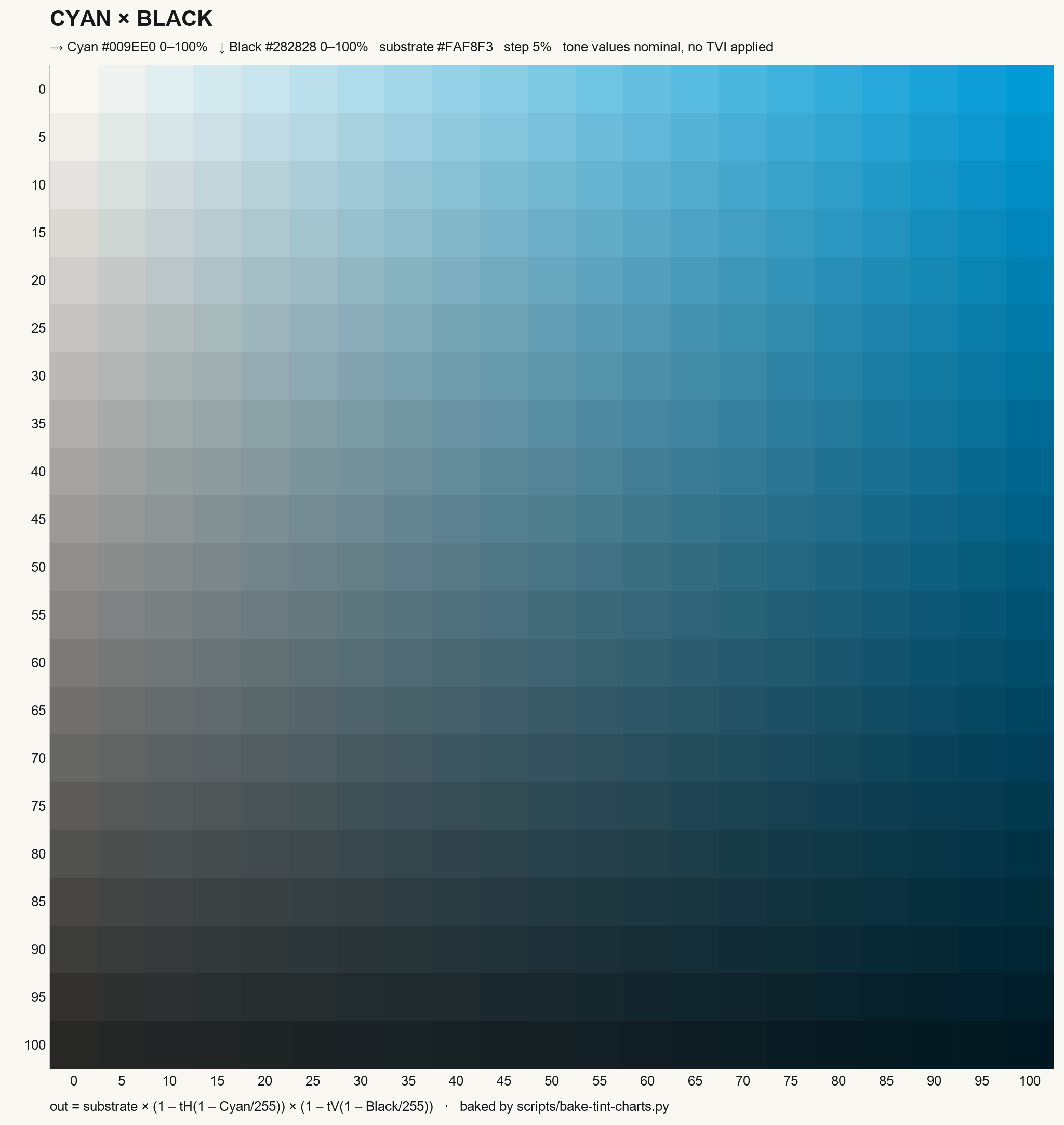
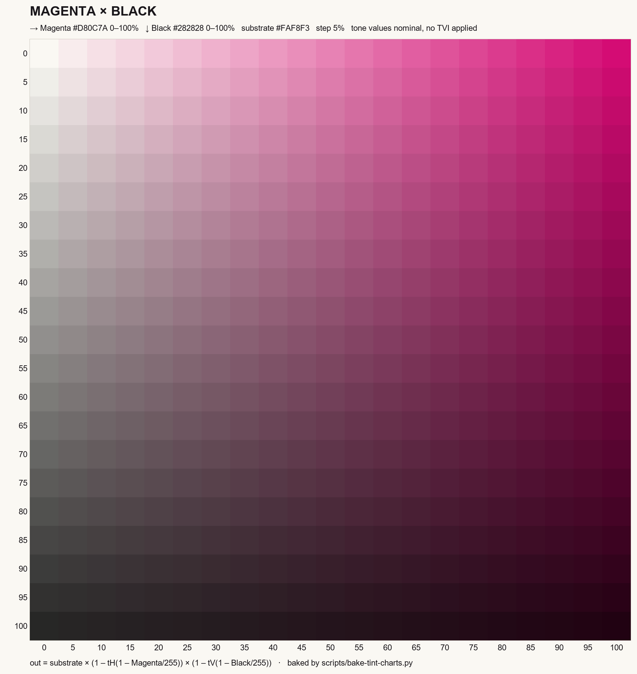
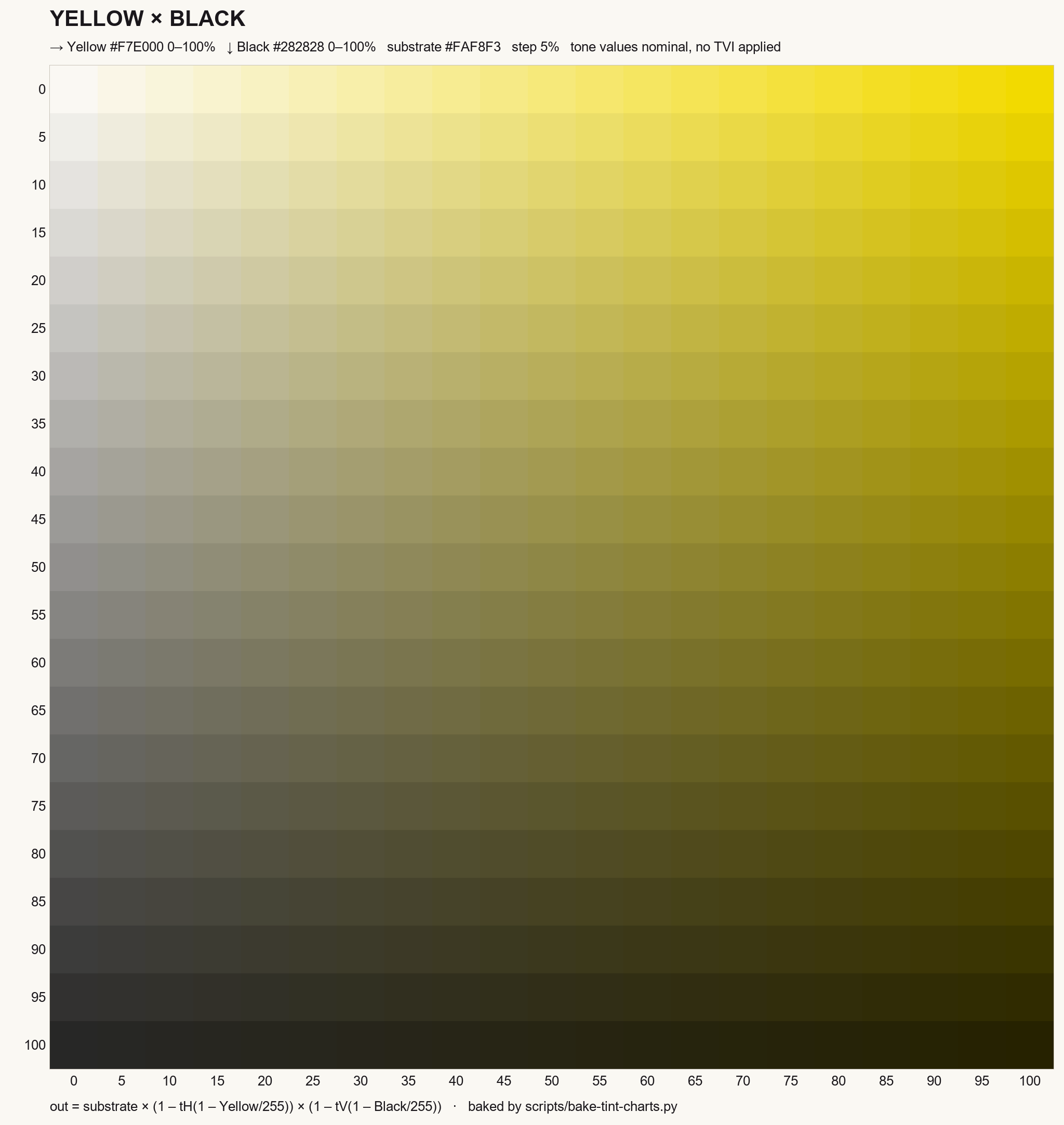
- Cyan × MagentaEvery blue and violet the two of them reach between them.
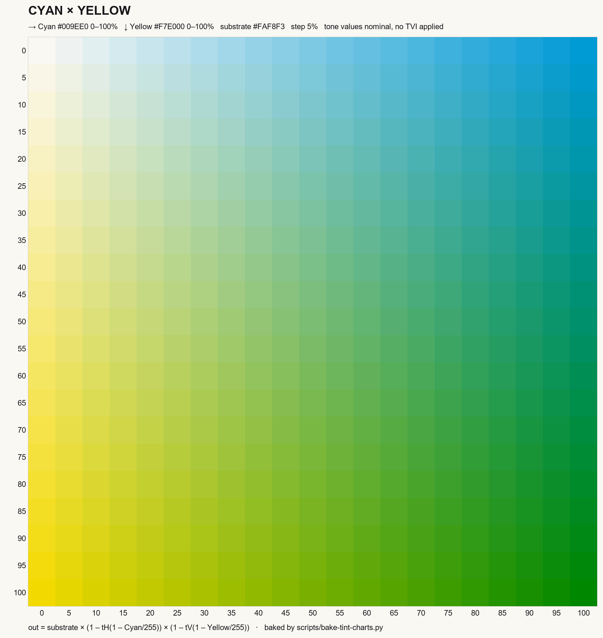
- Cyan × YellowThe greens — the widest range either ink has a hand in.
- Magenta × YellowReds, oranges and the warm end of the sheet.
- Cyan × BlackHow far a blue goes before black takes it.
- Magenta × BlackThe same question asked of the reds.
- Yellow × BlackYellow into olive into black, five per cent at a time.
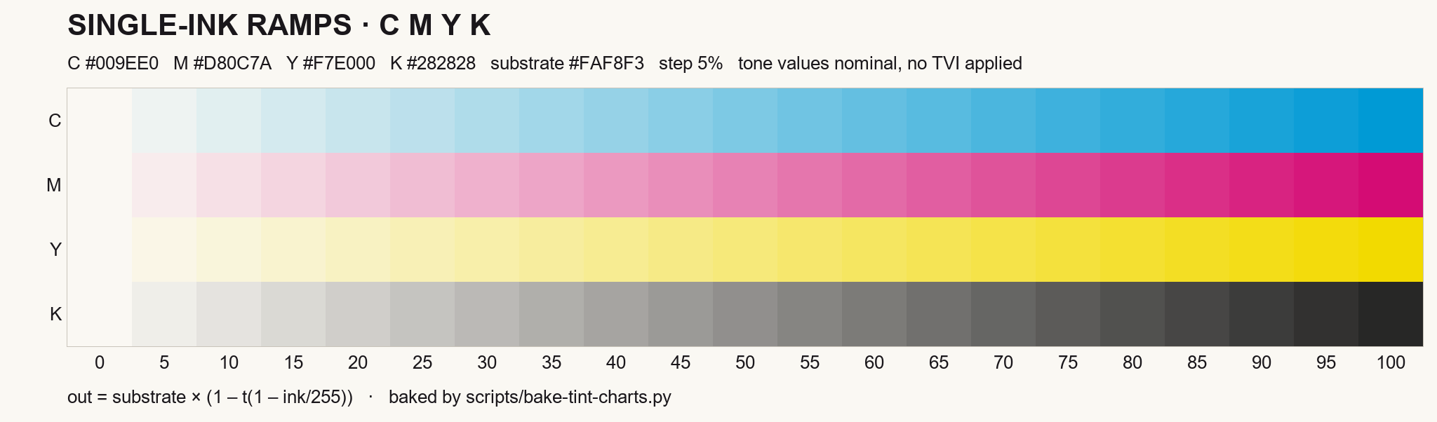
- Single-ink rampsEach ink on its own, 0 to 100, over the same substrate.
01
Spot colour: one ink, one cylinder, the same colour next lot
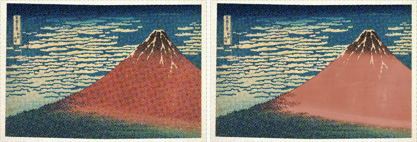
A spot colour is a single pre-mixed ink printed as its own unit, so it holds one exact colour run after run, unlike four-colour process dots.
CMYK · four units
Spot · one unit
- A brand colour built from CMYK depends on all four stations at once — if one drifts, the colour moves.
- Some brand colours are out of CMYK's reach entirely: a deep blue, a hot orange.
- Mixed as a single ink and given its own station, it depends on one.
- Pantone publishes 2,390 spot colours, each a formula by weight, mixed the same anywhere in the world.
- Quote the suffix as well — 485 C, U and M are three different colours.
- We hold brand colours to ΔE2000 of 1–2, against 2–3 for general print.
02
Metal: three ways to put it on, and the one we actually use
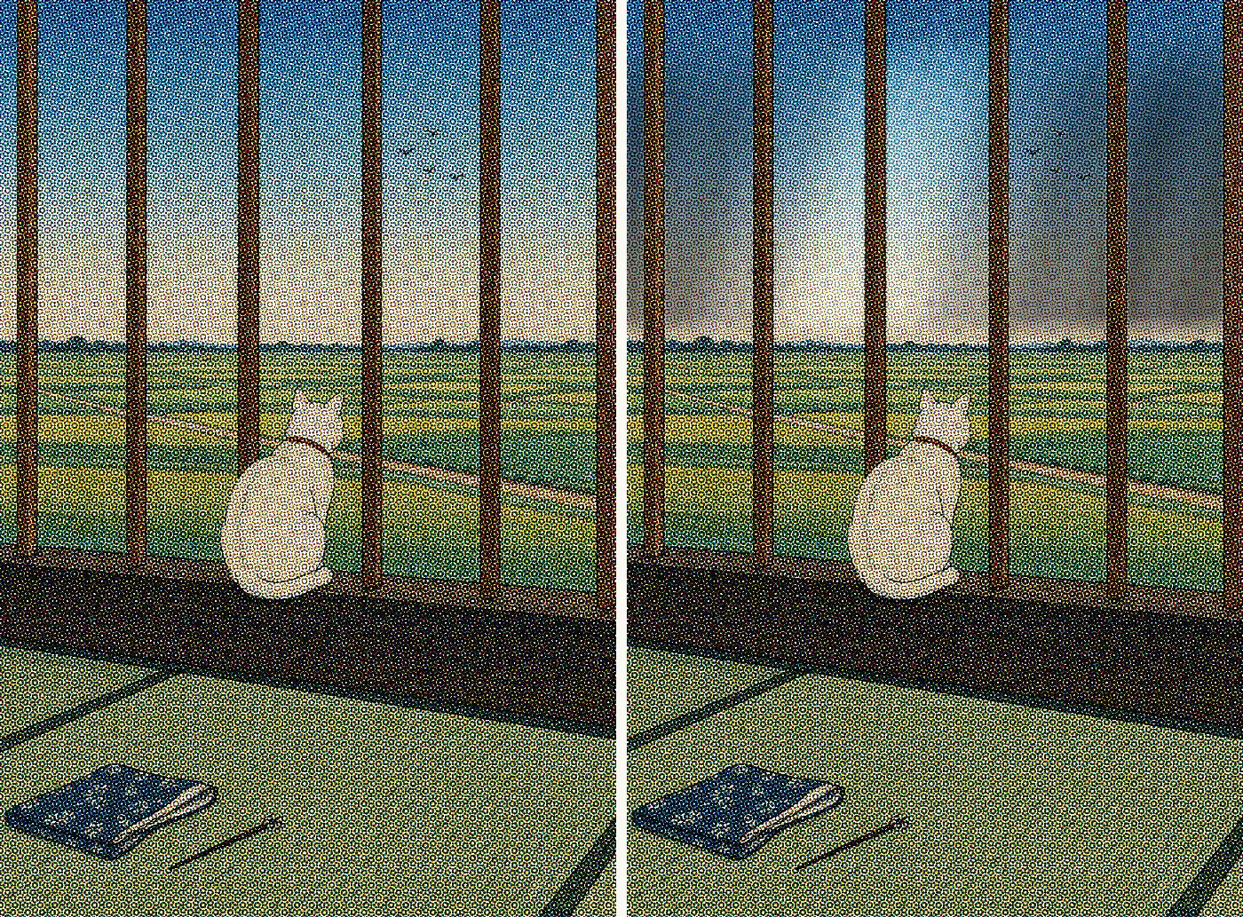
Metal on a pouch comes from metallic ink, hot or cold foil, or film that already carries the metal before the press ever touches it.
Printed on white
Printed on metallised film
- Metallic ink carries real metal powder and prints like any other ink: fine detail, no die, but the shine lives in the ink and dulls with age.
- Hot foil is the brightest and the only one you can feel — it needs a die, cannot gradate, and puts heat on thin film.
- Cold foil takes process colour over it in the same pass, so metallics can be coloured and graduated.
- Most pouches use none of the three.
- We print on metallised film: leave the white off and it reads as a mirror, put white behind it and it holds your colour.
03
Opaque white: the station that decides whether anything else shows
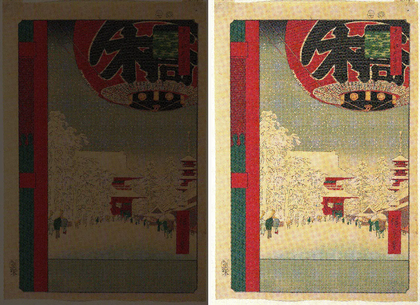
Opaque white is the ink layer laid down before colour on clear or metallised film, so the artwork reads instead of disappearing into it.
Nothing behind the ink
White laid down first
- Clear film and foil give a colour nothing to sit on, the way marker pen on a window is there but barely visible.
- So white goes down first — station 09 on this pouch — and every colour above it sits on that.
- It is the same fence the metal depends on: no white, mirror.
- Titanium dioxide does the work, scattering light the way fog scatters a headlight.
- The industry asks for 80% opacity and up, and about half of everything a flexible-packaging plant spends on ink is spent on the white alone.
04
Varnish: on film, ours takes the gloss away
Varnish is a clear top coat, gloss, satin or matt, applied over printed film to change how light reflects and how the surface feels.
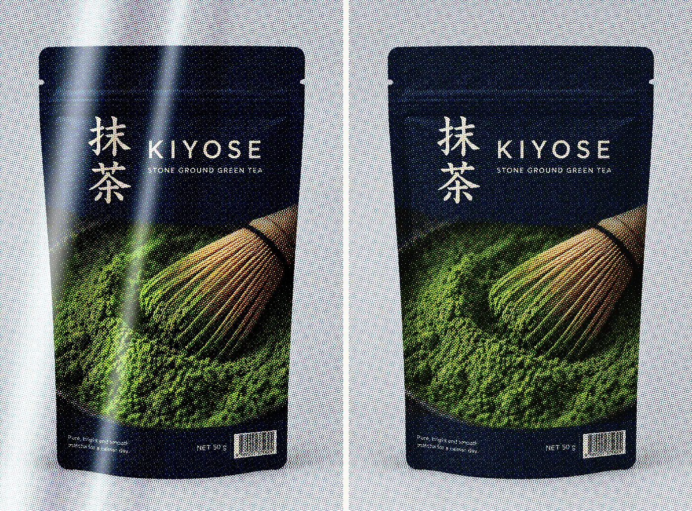
The film as it comes · gloss
Spot matt over it
- The film arrives glossy, so the untouched half here is the substrate's own surface.
- Gloss deepens the colour and catches every light in the shop.
- On paper the move is a spot gloss on a matt sheet.
- Matt hands some of that saturation back and returns a surface that holds no reflection and no fingerprints — which is what a pack that gets handled actually wants.
- On film it runs the other way: a spot matt on a gloss ground.
- The contrast is the whole effect, so the varnish has to be whatever the film is not.


